Website Copywriting Lessons from the Stationary Bike That’s Making Headlines
December 17, 2020
After a full day of writing email copy for a client, I took a late afternoon break to get in a quick workout on our relatively new Peloton.
I’m just under 10 rides in, so I’m still getting in a groove with it, but truthfully, that’s 9 more workouts than I did in all of Q3.
So basically, this very expensive machine has caused more than a 10x improvement in my workout frequency. (I’m really bad at math so if you want to actually calculate that one for me, go right ahead…)
While spinning away to the voice of my favorite instructor Cody Rigsby and his eclectically festive playlist, my copywriting stresses started to melt away.
If you have a Peloton, you likely get where I’m about to go with this.
If you don’t have a Peloton, this will likely help answer your burning question “WHAT’S THE DEAL WITH THE PELOTON THING!?”
I get it because truthfully, I wasn’t the one who pulled the trigger on buying ours. (Thanks, husband!) I had never even bought into the hype until I found it sitting in our spare bedroom.
And since everything in my life seems to be ripe for a copywriting analogy, here’s what I couldn’t help but think about on my 9-mile ride:
There are some serious copywriting & marketing lessons to be learned from this stationary bike that’s making headlines.
Allow me to indulge (and educate!) you on what Peloton is doing that makes it so addicting and that you too can implement to increase brand loyalty, engagement, and conversions…
NO. 1 – SOCIAL PROOF
From your first ride, you can’t help but notice the left-hand side of the screen that pops up with “JoeSchmo just hit his 200th ride!” and “MileyCyrus is on a 10-week streak!” (Okay, kidding on that one…) Not a moment of your ride goes by without you knowing, other people are using this, and they’re using it often.
This plants a seed in your mind of “I want that to be me!” So you form a goal in your mind and you start working toward it.
Copywriting moral of the story:
Add testimonials, screenshots, and recognizable client logos throughout your site. Keep them as relevant as possible to the rest of the content around them. i.e. If you’re talking about your Gold package, share a testimonial from your Gold package.
Extra credit: If you have digital or physical products, use a tool like Proof Pulse to have notifications pop up in the corner of your website letting prospective buyers know other people are buying, too! #FOMO
NO. 2 – GAMIFICATION
Building off of No. 1, Peloton also has tons of badges you can earn which takes you back to being in an arcade as a kid and wanting to earn all the tokens and stuffed animals.
Even as an adult, we can’t resist a good badge or certification.
Copywriting moral of the story:
Have a course? Offer some sort of certificate. The peer-vetted course platform, Terrain, crushes it at this (peep our course The Copy House on it!). They create badges for all kinds of things and we want them all!

Not to mention, here are some super simple website copywriting examples that are from our clients &/or industry leaders.
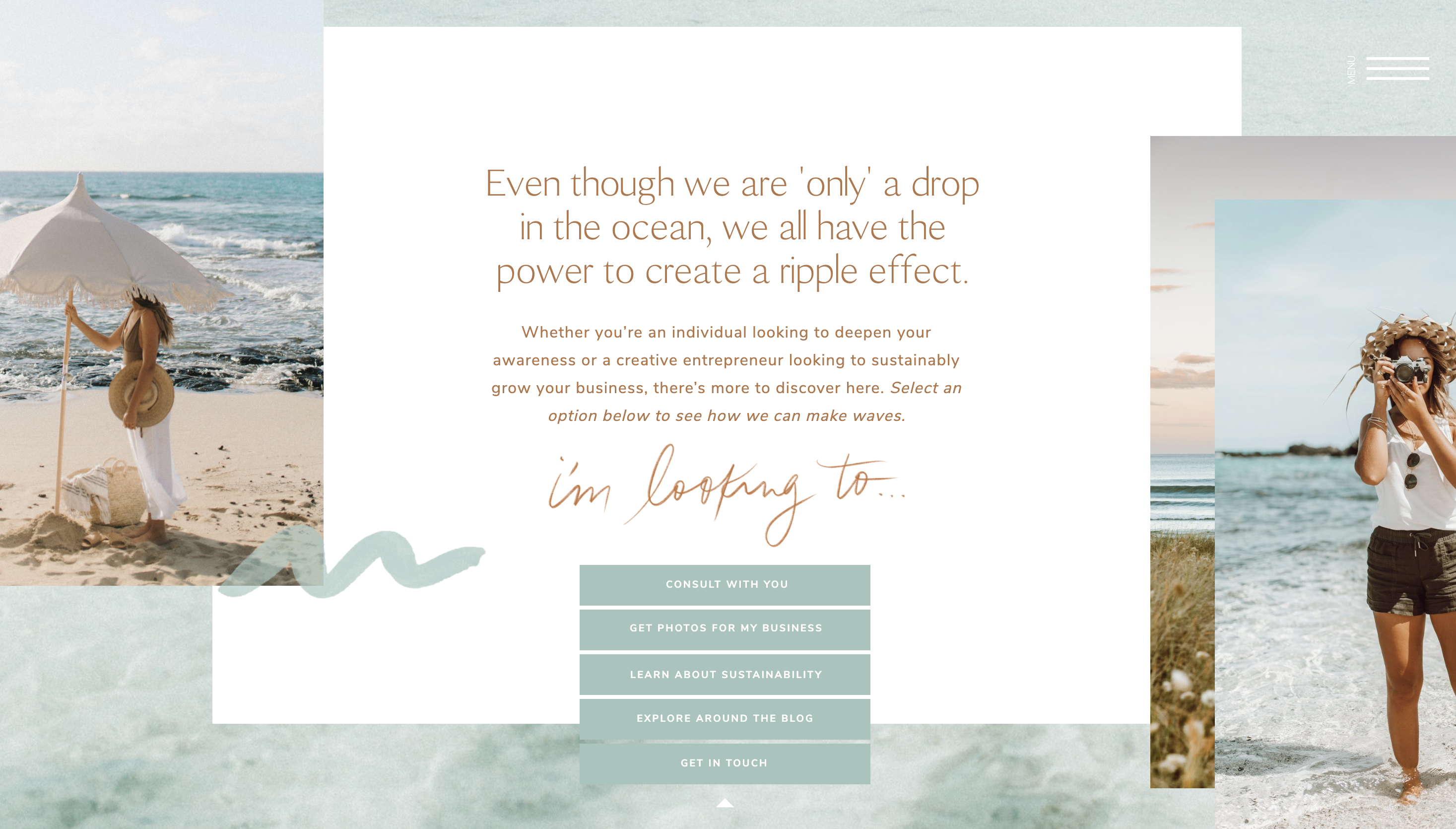
Elanaloo makes use of a drop-down menu that allows you to self-select where you want to go based on your needs. It’s like a game of “Choose Your Adventure” and it feels interactive.

Melissa of Stay Balanced Coaching takes her About page up a notch with a little game of “True or False” instead of just listing out personal facts about her. This increases engagement and time on her site as well as a personal connection.
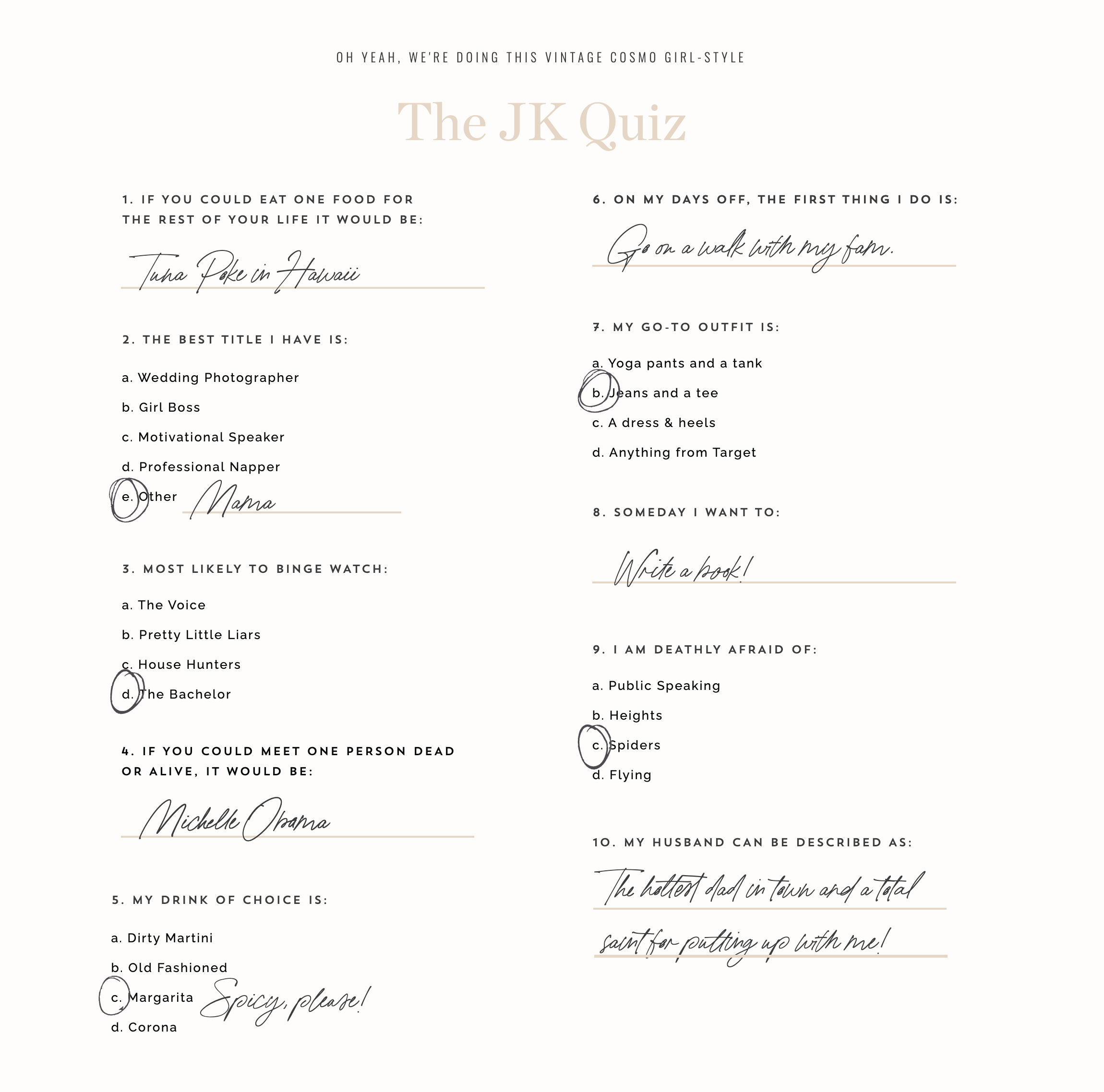
Digital marketing icon Jenna Kutcher implements a Cosmo-magazine style quiz to gamify her About page. Our friends at Tonic Site Shop crush it at this in their Showit website templates.
If you haven’t already caught on, there’s no wonder why online quizzes (like our Wine Quiz!) have spread like wildfire as a successful lead generator!
NO. 3 – COMPETITION
Ooooh this one’s a personal favorite – the Peloton leaderboard. As a former D1 athlete and total competitor, this gives me the motivation I need to push myself and improve my overall output. You can see both in real-time (or after the fact) where you stack up against other riders.
This is a natural element of being in business—there’s pretty much always competition. But…
Copywriting moral of the story:
Explicitly reference how you’re different than the competition straight from the homepage. You don’t have to name names or use the word “competition” but you could say things like “Other design studios manage up to 20 projects at a time. We only take on one—yours.”
Get clear on your differentiators and how you serve as a contrast to your industry then make sure that’s explicitly known.
NO. 4 – AFFIRMATION
If you take a live Peloton class, it comes with the possibility of receiving personalized encouragement from your instructor…in front of thousands of other riders. Who wouldn’t feel fired up or have a boost to the ego after that?
A simple “I see you kaitlynparker, hitting your 10th ride!” goes a LONG way. It tells you someone’s watching. Someone cares. And you want to make them (and yourself!) proud.
Copywriting moral of the story:
You can do this through your website copy too. Don’t focus on all pain points and no victories along the journey. Your reader needs to be reminded that they DO in fact have what it takes. They may be battling a lot of external factors outside of their control that prevent them from (for example) showing up on the bike every day, but when they do? That’s a BFD.
And it deserves to be celebrated. So acknowledge those small successes along the way.
NO. 5 – PERSONALIZATION
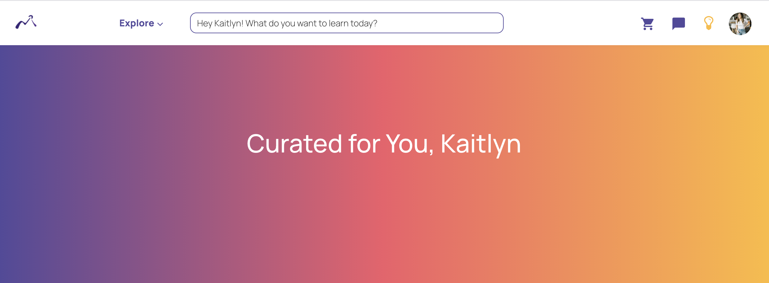
Upon sign-in, the Peloton dashboard shows you your favorite instructors and recent classes you personally may like, which makes it incredibly easy for you to select and get to happily riding right away.
It makes you feel like hey, this app cares about me as an individual and there’s something here for me.
Terrain again crushes it at this by asking you the subjects you’re interested in and then presenting you with a curated list of course recommendations based on those preferences. #yesplease
Huge e-commerce sites like Amazon obviously do a great job of this, too, but you can implement it with a lot less tech involved.
Copywriting moral of the story:
Keep the “Rule of One” close to heart. If you have multiple audiences, lead them to separate sales & landing pages. Segment your email list where necessary to keep your content focused. Speaking to everyone not only converts less but is way harder to write to begin with.
NO. 6 – PROGRESS TRACKING
The Peloton app also houses all of your badges and number of workouts on a calendar-view of which days you worked out and what your stats were for each workout.
‘Tis detailed and I like it.
Copywriting moral of the story:
This one is a bit more advanced but it can be as simple as sending automated or manual check-in emails to your students as they progress through your course or program.
On a much simpler level, it could also look like a clear 3-step process that demonstrates how your prospect can go from where they are to where they want to be.
For example, see how our client Dartboard Media does it.
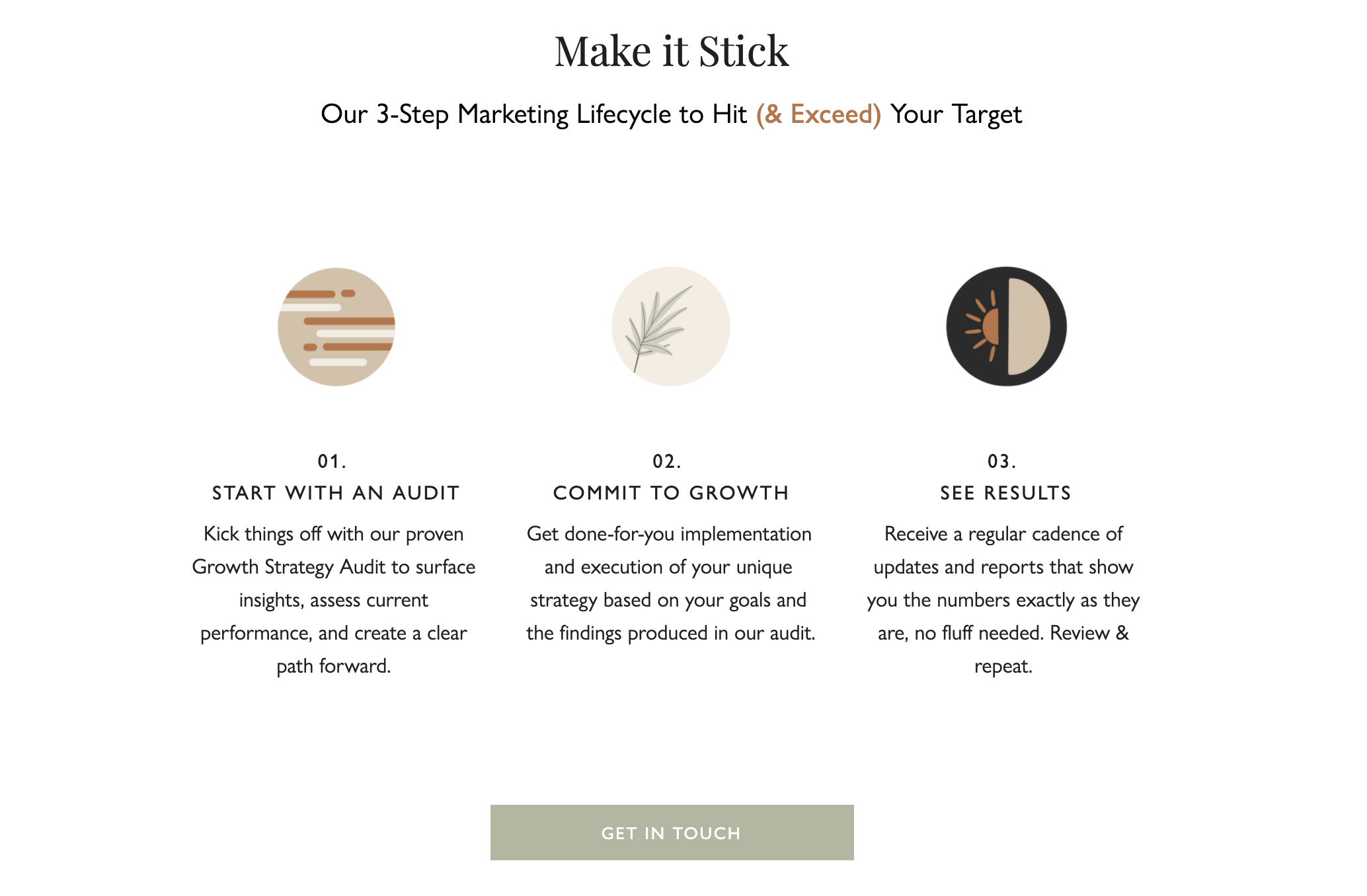
When people feel stuck—as they often do before reaching out to a service-provider—they want to know you have a simple framework for helping them to achieve tangible progress & results.
NO. 7 – ACCESSIBILITY
Okay, admittedly, this doesn’t apply so much to the price point of a Peloton but they’ve nailed it on ease of use.
Truthfully, accessibility isn’t always just about price point anyway. It’s about understanding.
If people don’t understand what your product/service is, how it works, or the transformation it promises, it’s not accessible.
Sometimes you have to step outside of the proverbial wine bottle of your brand that you’re in and try to explain things in layman’s terms.
What are the simplest features or pillars of your business that you can outline in your copy so your reader has the feeling of “Ohhh, I get it…” (Hint: visuals come into play here, too.)
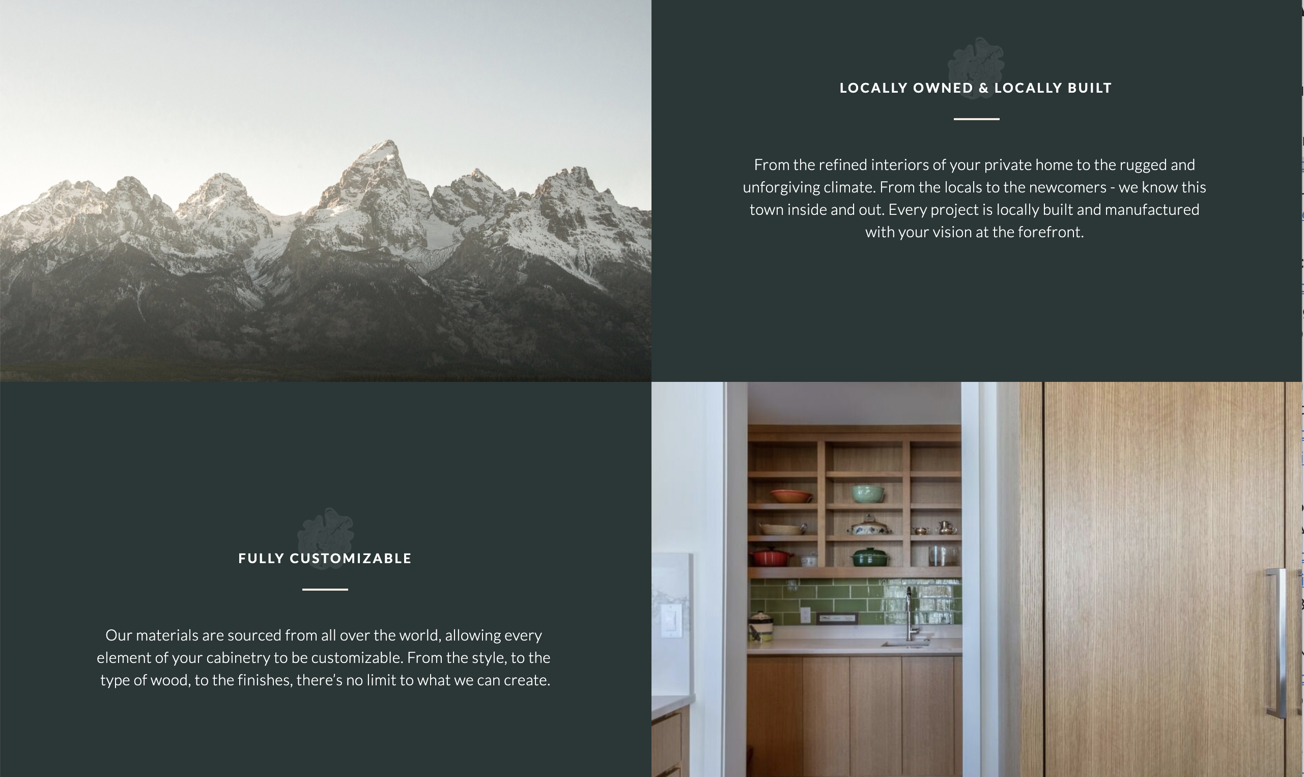
Here’s how we pulled out brand pillars for our client D&E Custom Cabinet.

—
SO, which of these strategies will you be implementing in your copy?
Fellow Peloton user & copywriting enthusiast? Let us know of any strategies we missed in the comments below!






Read the Comments +