Your website is one of the best and least expensive branding and marketing channels you could have for your business. Within a mere 5-8 seconds, it can either draw your visitors in or have them clicking right off and over to a brand other than yours.
And who wants that..?!
So how do you get them to stick around? With a combination of the right design & copy strategically positioned throughout your site, you’ll be well on your way to earning their confidence in your products/services and moving them to action.
Here’s 10 quick fixes you can implement, so you don’t lose another prospect.
01 – Include a Brand Statement
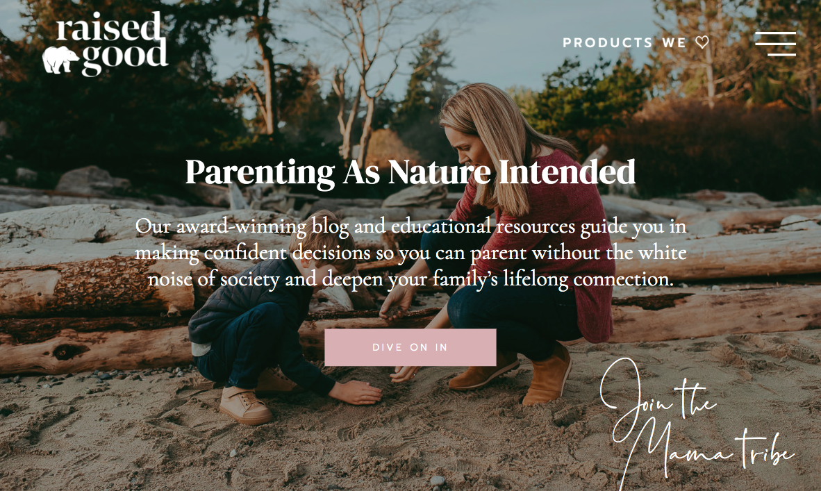
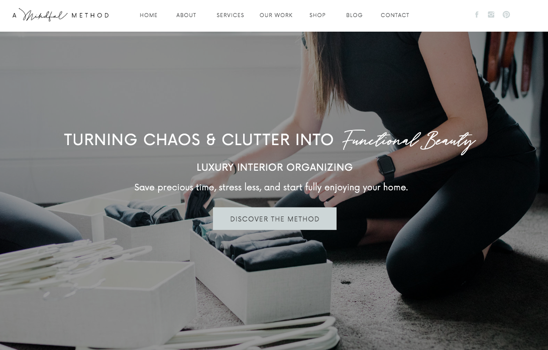
Within the first 5-8 seconds of landing on your website, your readers need to know how you can help them. That’s where the brand statement (also referred to as a brand bio, one-liner, value proposition, etc.) comes in.
You need to address the problem they have, the solution you offer, and the outcome (or end result) as clearly as possible.
This statement would ideally be centered on the page in a prominent font, and included “above the fold” – which is tech-speak for being framed within the initial screen, without having to scroll.
Here’s a couple of examples from our clients’ websites:
02 – Include a Prominent Call-to-Action (CTA)
Ideally, this will be placed in the top right corner &/or directly below your brand statement…and then repeated throughout the site.
It may feel direct, but your reader should never have to search through your site trying to figure out how they can work with you.
One key tip – make this as easy and obvious as possible. It’s definitely okay to be bold here.
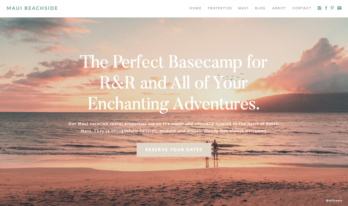
Here’s another example from a client website. See the “Reserve Your Dates” button? It tells the reader exactly how to engage with what Maui Beachside has to offer.
03 – Ensure Your CTA Buttons Stand Out
This one goes along with #2 – both your copy and the design of the button should be very clear.
Depending on your products/services, it should read something like “Book/Buy/Shop Now” or “Start Free Trial” or “Start Here”. It should feel like an invitation and leave no confusion as to where you’re taking them.
Additionally, I recommend making it a different and more eye-catching color than other text you might use on the page.
It’s the golden ticket – your revenue generator – so don’t let it blend in and get lost.
There should also be a call-to-action button at the end of each page, so you’re never leading the reader to a dead end.
04 – Get Rid of the Noise
Sometimes we get so excited about all that we have to offer that we just keep adding content sections and paragraphs and paragraphs of text.
But you don’t have to show EVERYTHING you have to offer right from the get-go.
Unfortunately, this just sounds like more noise to your reader and their brain has to work hard to sort through it all!
They shouldn’t feel overwhelmed or wondering where to click first. Option paralysis is a real thing!
Even if you feel like you couldn’t possibly part with some of your content, in the words of Stephen King, “Kill your darlings.” Which basically means, if there’s a bit of copy you love, but it’s doing nothing for your reader, scratch it!
If you really HAVE to keep everything, consider creating separate subsites for your main products/services if you have to. Online educators like Jenna Kutcher and Jasmine Star do this.
This helps follow the “Rule of One” in copywriting which means you’re always only targeting one reader, with one big idea, one promise, and one offer.
05 – Leverage a Footer Menu
On that note, keep your main menu/navigation very simplified.
Less is more and now is not the time to be cheeky with your copy, but clear. They should know exactly where each menu item is taking them.
If you have a lot of content/pages to direct your reader to, you can also make use of a footer menu that slightly differs from your main menu for things like customer care, privacy policy, about, returns/shipping info, etc.
Donald Miller refers to this as “the junk drawer”.
06 – Keep It Skimmable
Length is largely subjective here, but try to keep your home page “skimmable”. It helps to rely on headers and subheads, with just brief bits of body/paragraph copy that feel digestible and further articulate the message of the headline.
You see this a lot on SAAS and eCommerce websites.
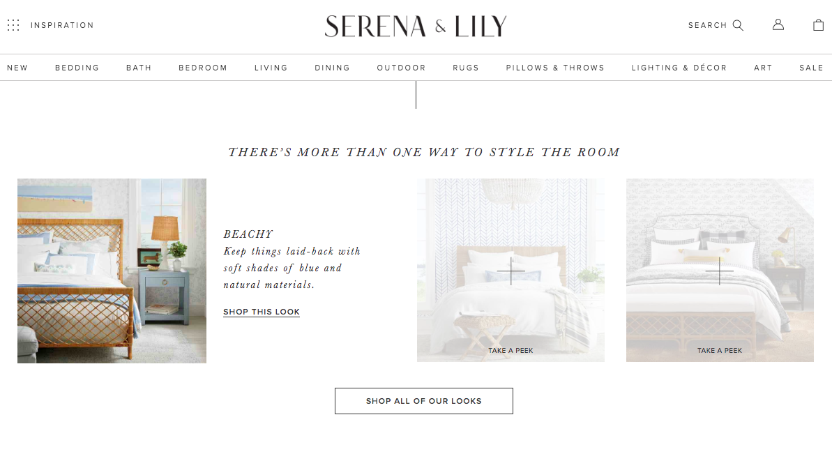
You can also leverage various design elements or ‘Read More’ buttons that allow an engaged reader to click to get the rest of the story/info. without feeling bombarded by a ton of words at first glance.
07 – Use Imagery to Drive the Story
The images and graphics you use on your website should obviously go hand-in-hand with your words.
Emotion-driving photography does wonders here.
Ideally, your images will show the outcome of working with you – a happy mother whose kids are eating their dinner, a homeowner admiring his new windows, two creatives cheers-ing to a job well done – whatever suits your client/customer solution.
If you’ve never invested in a brand photoshoot before, we highly suggest it! The overall impact on-brand photography can have on your site’s overall look and feel is HUGE!
08 – Include a Quick Intro./Image of You
This is especially important for personal/solo businesses like wedding photographers, copywriters, designers, etc.
People want to know who they’re working with, because a lot of it is about having a personal connection or resonating with your unique style.
However, now’s not the time or place to share your life story. The focus should still be on them although you’re talking about you.
Think: a brief, client-focused paragraph that then links to your About page where they can read/learn more.
09 – Include Social Proof (Testimonials, Big Name Clients)
Almost immediately, your reader is asking: Is this person legit? Can I trust them? Have they helped others?
(No pressure, right?)
So showcasing a few happy clients, or showing some of your biggest clients isn’t showing off, it’s building credibility.
No need to have hundreds of testimonials or tons of clients. Strive for at least 3. Donald Miller of StoryBrand advocates this number because it keeps you in the role of the guide, not the hero.
Once you go overboard, you enter hero territory – and that is the part your client/customer is meant to play!
We like to mix up the testimonials throughout the site so that each testimonial is speaking closely to the rest of the content (or offer) on the page!
10 – Include an Email Sign-Up with a Compelling Offer
This one is really non-negotiable although so many people figure they’ll get around to doing it eventually.
“I wish I didn’t start building my list so early”, said no one ever!
That being said, you’d be hard-pressed to get subscribers on board when you just offer them another opportunity to “Sign Up for My Newsletter.”
We all get plenty of emails as is! To make it compelling, you have to give away something your target client will see as valuable, which will also make strides in deepening that trust factor and garnering authority.
This opt-in offer – or lead magnet – should not be random. It should relate to one of your revenue streams.
You can learn LOTS more about creating a lead generator of your own in this IGTV video.
—
Questions, comments or more to add? Pop them in the comments below!

PIN THIS POST FOR LATER:


Read the Comments +