


How “The Medium is the Message” Applies to the Copy x Design Creative Process
July 5, 2022


As any Communications student will recite to you: “The medium is the message,” as stated by Communications theorist Marshall McLuhan.
Essentially, “each medium, independent of the content it mediates, has its own intrinsic effects which are its unique message.”
In layman’s terms: the HOW/WHERE of our communication is often just as important as WHAT we’re saying.
Example 1: This is why a social media strategist will often tell you each social platform has it’s own ‘language’ and your captions should ideally be adjusted to best suit each one for the most effective cross-platform posting.
Example 2: This is why getting broken up with via a text message feels like such a slap in the face. It’s a crappy medium for expressing something so sensitive. The fact that it came through a text, says more than the words themselves.
Further, “the medium is the message” is such a big deal because it’s the “medium that shapes and controls the scale and form of human association and action.” (Understanding Media, NY, 1964, p. 9)
??
While McLuhan coined this line of thought long before the internet, it certainly extends to the digital age, and more specifically, even to the nitty-gritty of the relationship between #copyxdesign, as it relates to the creative processes behind branding and marketing.
Effective copywriters are also communication strategists—we work to fully understand the initial medium (or format) of where the copy will live, and how the copy + design will play in tandem, to ultimately deliver the most impactful message.
We’ll be the first to admit: the copy itself isn’t of much use without understanding how/where it’s being used (the medium) and vice versa. That’s a large percentage of determining WHAT to write in the first place.
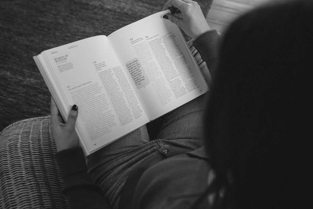
So even though we spend our days inside of boring Google Docs, we don’t write blindly. We visualize how it will look, how it should function, and what can be left unwritten—and instead, felt or experienced through a non-written means like photography, videography, or a whip-smart and functional design element.
It’s such a highly symbiotic relationship.
Also worth noting: I feel strongly that the term ‘design’ can extend beyond the context of ‘graphic design’ ‘brand design’ or ‘web design’ and be used to encompass the entire ‘medium’ or architecture of a specific piece of work – including the role that visual assets like still images and videos play in it.
See it in action through some of these ads and website examples:

Via coda.io – Without the image of the woman slapping a legit ‘sheet’ over her face, the headline wouldn’t make as much sense. But since this witty wordplay is paired with a visual ‘design’ element, the meaning comes to life within the medium of a website – where the purpose is to educate prospects & further the sales process.

For parker-fg.com – This was an ad I threw together for my husband’s company for an upcoming summer tennis tournament he’s sponsoring. Before working on the ad copy, I needed to understand the medium – (a printed quarter page ad for the tournament’s program of events). To help the ad stand out, we zeroed in on the context of the event and did a witty play on the tennis term ‘ace’. My goal was to try to be part of the conversation, rather than having the ad feel less relevant. I also considered how we could keep the primary headline simple & obvious by incorporating design elements – rather than solely relying on the copy to do all the hard work. So we used a tennis ball-looking element and an easily identifiable shade of tennis ball green (both of which are not part of his typical brand color palette) to make it feel intentional and festive. Copy came first, as design was considered, to create an effective ad for a printed medium.
So yes, copy first!! But copy first doesn’t mean the design is neglected from the start. Because the medium and the design of it are just as much a part of the message as the copy.
Phew! Does this make sense? Did I lose you at any point? Drop your questions or thoughts below to continue the convo and we’ll try to update this blog post over time with additional examples.
Cheers,
Kaitlyn
RESEARCH SOURCES


Read the Comments +