Our first-ever course / group program launch is officially IN THE BOOKS! Along with the celebratory toasts (and much-needed naps!), in true CU fashion, we’re recapping our course creation and launch experience in hopes you can learn from it, too.
The Lead-Up
First of all, creating The Copy House™ started OVER a year ago. It was around mid-2019 we sent out the first survey, originally anticipating this program would be a “mini-course”. I’d taken, non-coincidentally, a mini-course about creating a mini-course. Say that 5x fast.
Although I’m a huge advocate for simplicity, the more I tried to distill down the beast that is website copywriting into a ‘mini-course’, the more I got frustrated with it.
I just didn’t see how I could do it without either undervaluing the program or short-changing the content. I also wasn’t crazy about just developing a “course” because a lot of those already existed. I guess I was fearful that people would roll their eyes at yet another course – or worse, buy it and never give it a second glance.
I’m a words-of-affirmation kind-of-person, so I thrive on feedback. Not for the sake of stroking my own ego, but to really find out if what I’m doing is creating a tangible result for my intended audience. I know I like added support, accountability, and feeling seen and heard, so I wanted to create that for each student that chose to invest in The Copy House™ (TCH).
After talks with peers, trusted mentors, and our small team, I finally landed on a “group program” approach for our first cohort. This felt right for starters, especially to get that much-desired feedback and then tweak the program as needed.
I will say, I hope to eventually (as in the not far off future) make the program regularly available so that people can get in and write their copy when they need to – not wait around for doors to open.
Once the format was loosely decided on, we sent out another survey to confirm our hypotheses and gather any additional needed info before sitting down, rolling up my sleeves, and doing the work to create it.
Then was time to decide on the name and how to brand it.
NAMING & BRANDING
As far as the name goes, as we shared on the TCH sales page, it all started with a trip to France in 2018. (Yup, the same trip that inspired the Copy Uncorked brand!)
Throughout Northern France, in small towns like Reims and Epernay, are some of the world’s most iconic champagne houses.
Known as the Champagne region – and the only region whereby a glass of bubbly can technically be referred to as champagne – they provide an experience, unlike most small American wineries where you simply belly up to the bar for a tasting.
In France, you book this elaborate experience in advance where you’re then taken on a guided tour throughout the property and down into the cellar to witness firsthand where the magic happens. All the while, you’re being taught about the history of the house, how it was founded, how it’s made, and what makes this great champagne so unique.
As you exit the cellar, with your palette now watering, you’re given a full pour of this glass of bubbles you’ve been hearing so much about. At this point, you and the group are mingling, sharing travel tips, and discussing your favorite champagne house visits so far.
You’d be hard-pressed to leave without at least a full bottle, and most likely a few souvenirs from the high-end gift shop.
I started to imagine how a similar, guided experience like that could help you craft your own website copy in a way that has your readers raving about your brand and the right people coming back for more.
…That’s when I decided “The Copy House™” it shall be!
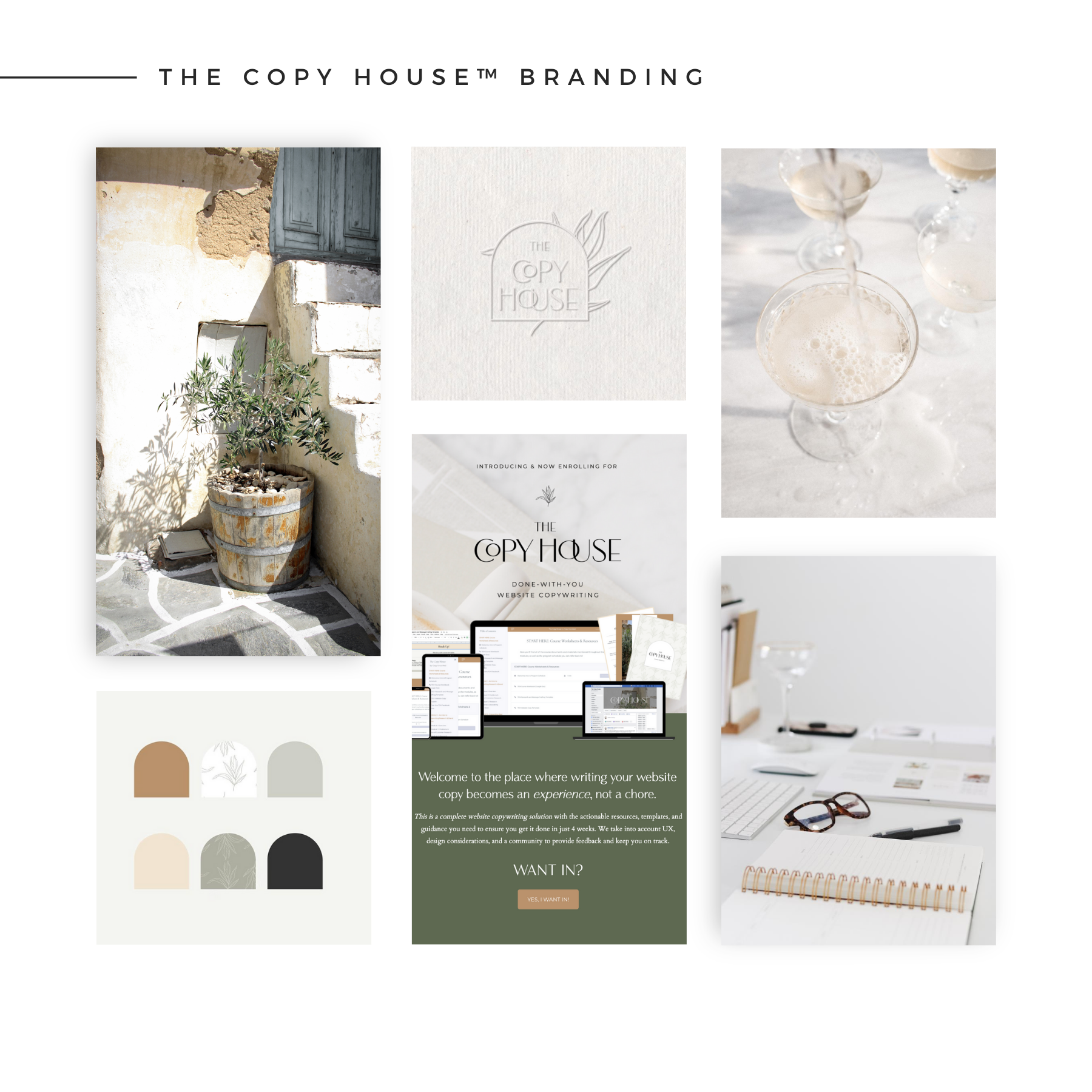
With that decided, I reached out to my go-to – Kadie of Drop Cap Design – to work her magic once again and create the visual branding for the program.
Keeping the French / European vibes in mind, we landed on a complementary color palette to CU with an almost art-deco feeling logo and beautiful olive leaf illustrations to make you feel like you’re spending the day at a low-key wine bar with friends.
With the branding wrapped up, I continued progressing through the course creation and eventually, to writing alllllll of the promo copy. I started with the sales page copy, the did a preliminary design of it within my Showit website. I then enlisted the help of Jen Olmstead of Tonic Site Shop to give it her ridiculously talented touch. Like seriously, her ‘after’ was 1,000% better than the ‘before’.
This part of the process started to feel really fun and collaborative as Kelsey, myself, Kadie, Jen, and my friend Brooke were all helping me to bring it to life. BLESS THEM ALL.
Okay, now what you really came for…
THE TOP 5 LAUNCH LESSONS
01. Bonuses are not B.S. – especially if you do them right.
I knew I wanted TCH to have an element of 1×1 support – but without completely overloading my calendar with more 1×1 work, which would sort of defeat the purpose of creating a course, in part.
We decided that rather than tack on more templates, tools, or things students had to sort through and write, we’d offer up 5 free Website Copy Reviews for the first handful of students to enroll. To give you perspective, the price of the Website Copy Review is worth almost double the price of the course itself.
I had no idea how successful that would be, but they were basically sold immediately after the first ‘cart open’ email went out.
This “fast-action bonus” incentive led to our biggest sales day. That feedback was HUGE.
I’ve heard bonuses described before as “peanut butter and jelly” – meaning your bonuses should complement your main offer and truly add additional value, not just toss something into the pile to say you did.
That being said, we will definitely bring this bonus back and continue to look at ways to drip bonuses throughout the launch period.
So in case you’ve ever wondered, “Do bonuses really make a difference?”, our answer is a resounding yes.
02. Beta testers are critical.
We didn’t have time between finishing the course and launching it to allow for beta testers to complete the course in full. However, we did send it out to a handful of trusted industry peers for their honest feedback of all materials, the module content, and organization, etc.
This was integral in giving me the confidence heading into launch week and obtaining usable social proof for the sales page. Our first cohort will also be serving as a sort of ‘pilot’ or ‘beta tester’ group and each student will maintain access to course updates for the lifetime of the program.
I really can’t say it enough…Get feedback! Talk to your customers! Ask questions! Be curious, be earnest, be genuine!
03. Also…ask for help.
I started off pretty confident in the fact that I could do all of this on my own. (It’s okay, you can laugh…)
But after writing over 100 pages worth of course content in a Google Doc while maintaining a full client load, I thought my brain had literally turned to mush. I hit a week where I didn’t even want to look at any of it.
That’s when I got clear on what I could do and what I was best served to get help with. That bit of delegation allowed me to drill down and get the rest of it done.
Admittedly, I did write some of the promo copy (emails, social media captions) in real-time during launch week. Which meant I also had to manually monitor my list to tag launch opt-outs and purchasers in Flodesk.
In the future, I’d aim to have a full sequence of emails pre-created (like I’d do for a client!) and then automated to drip out and handle a lot of that manual lifting for me.
BUT, since I was the one writing everything anyway, rather than kill myself to get it all done ahead of time, I gave myself grace and embraced the fact that I was writing them as things went on. This also allowed me to make them as relevant as possible to the current pulse of the launch.
04. Customer service copy is just as important as the sales copy.
During our cart open week, I also tasked myself with ensuring we had customer service emails to send out to students throughout the duration of the program. Too many times I’ve had the experience of purchasing a course, getting access, and never hearing another word from the creator.
Not only does that do nothing for helping your people actually complete your program and achieve the end result, but it just doesn’t leave them with the warm and fuzzies. And at the end of the day, this is about connection and being a catalyst for real transformation in someone’s life.
So, I feel good knowing we’ve mapped out email check-ins throughout course milestones as well as caption copy for our Facebook group to encourage engagement.
This may seem like ONE more thing you have to do in the mountain of launching a course, BUT think of it this way: If you don’t communicate proactively, you run a higher likelihood of fielding MORE questions and concerns, as well as potentially less positive student correspondence.
05. Always be list-building.
We did all the right things in terms of setting up a landing page, creating a waitlist, and promoting it leading up to the course launch. But again, since we’re a small team and I was so busy with course creation + client work at this stage, it didn’t leave me with much capacity or bandwidth to really strategize how to further grow our list.
However, with the course now created, list-building will continue to be at the forefront of our content strategy in hopes of connecting with more of the right people who need what TCH has to offer.
Good copy is a heavyweight champion, but even the best copy in the world can only do so much. You’ve gotta grow and tend to your list over time. {Notes to self and ends rant…}
Those really feel like the Top 5 Launch Lessons for now, and no, I’m not going into the financial details of the launch. ? But I will say, for $0 in paid advertising and low-costs to create everything, it was a profitable launch. I’m really happy with the quality of students inside The Copy House™. So far, each one feels like a great fit, engagement has been solid, and I’ll take quality over quantity any day.
Not to mention, the bulk of the work is behind us and the sky’s the limit from here! I’m really excited to grow and evolve the program and make it a primary CU offering. It’s brought out the English major and one-time college professor in me, so I’m enjoying the teaching / coaching / community aspect even more than I thought I would.
A PEEK BTS AT THE TECH INVOLVED
Lastly, here’s a little peek behind-the-scenes at how we brought the program to life – without taking any sort of step-by-step course, investing in high-tech, a production team, glam squad, or anything like that. Just a focus on the content itself and beautiful design.
HOW WE DID IT:
(1) Trello for Project Management
We started with a detailed launch board in Trello that organized all content, docs, links, tasks, timelines, etc. That was critical and allowed Kelsey and I to stay on the same page. It kept the intense overwhelm at bay because I always knew what I needed to do next and tried really hard to just take things one step at a time. If you’re curious about this or want a template in the Shop, let us know and we’ll consider it!
(2) Google Drive for File Management
I’m also pretty OCD about our file management system. Whenever I started a new project, I create the folders I’ll need and decide on the naming convention for things to keep it all consistent. You have to think, you’re building a business, and if you want that business to remain streamlined and accessible overtime, you have to do as much as you can to stay organized AS YOU GO. Not once it’s all built up, you can’t find anything, and you just want to throw your hands up in the air. Folders! Color-coding! What amazing little tools.
(3) Canva Pro for Slide Design
Trust me, I looked into Keynote, Powerpoint, and pretty much every other tool you could use to create slides and I just cannot function in any of them. So I resorted to my trusty Canva – a user-friendly graphic design tool we already know, use, and love. Why make it harder than it needs to be!? Kelsey was a champ with this one, too!
(4) Loom for Screen Recording
Trying to figure out video stuff makes me sweat. It stresses me out so bad. So once again, I stuck with what I know – Loom – which is one of the easiest screen-recording tools on the Internet (it’s actually just a simple Chrome extension). Once the Canva slides were created, I opened them in a Presenter view and started recording via Loom – some with my face, some without. This made recording a breeze and no editing involved. I basically couldn’t mess up while recording, but ya know, no pressure…HA.
(5) Podia
I also looked into just about every course platform out there – Teachery, Kajabi, Kartra, Teachable, Thinkific…you name it..and landed on Podia. I loved the all-in-one solution that could also host our digital products and grow with us as we built out additional ones. They also had a clean interface, a killer customer support team, an affordable package, affiliates, payment plans, hosted all files, no fees – literally, everything I needed. I’ll keep you posted on how it continues to pan out but so far, I’ve loved it and our students seem to be having a great learning experience with it.
Note: I did keep the sales page designed and hosted on Showit, however!
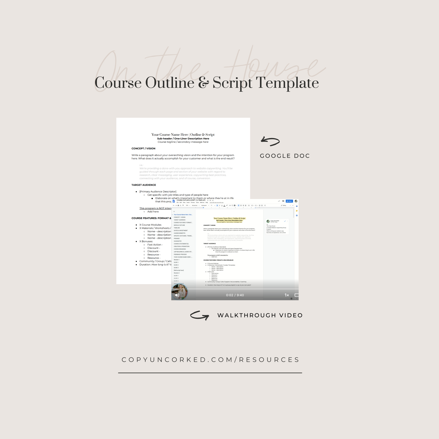
(6) Master Course Outline & Script Doc
Lastly and arguably most importantly, I kept the full course outline + script in ONE mega Google Doc. You may want to break yours up by Module, or whatever works for you, but I decided the less files floating around the better. This worked great and also allowed Kelsey to work on some of the slide design as I continued progressing with course development.
This document was also instrumental in crafting the sales page as the details had already been ironed out.
Curious about this master doc of sorts? Good news! Find a templatized version below…
WANT TO CREATE & LAUNCH A DIGITAL OFFERING OF YOUR OWN?
Planning to create a course or signature program of your own but have no idea where to get started? Swipe our Course Outline & Script Template (via Google Docs!) to begin planning out your program and creating your content. It also includes a 9-minute walkthrough video so you know exactly what’s what.
Get it sent to your inbox here.
This recap ended up being way more words than I thought it would be, but I hope it’s helpful to you! If you have questions or would love a part 2 or deeper dive in any area, let us know in the comments below.
And if you’re super curious about this “Copy House” we’ve been speaking of, learn more and get on the waitlist here. When doors open again in the near future, we’d love to see you inside!


Read the Comments +