Sitting down to write your website copy always seems like a relatively easy task…until you start questioning everything, end up in the trenches of Pinterest, and comparing yourself to every other website on the Internet.
Dramatic? Maybe. But Truthfully, as a creative service provider, the Services page of your website doesn’t need to be complicated. In fact, it shouldn’t be!
After all, it’s a primary lead-generating page of your site, but a lot of its success also depends on other factors. (Your visual branding and overall brand awareness, how the person got to the page in the first place, etc.)
That doesn’t mean we want to ‘skimp’ on this page by any means, but what’s most important, is that your Services page clearly outlines what you do, who you do it for, and how efficient it is for you to help them get from Point A to Point B.
Typically we like treating Services Pages much like a “Sales Page”, which follows one of several copywriting frameworks to aid with the flow of information and enhance conversion.
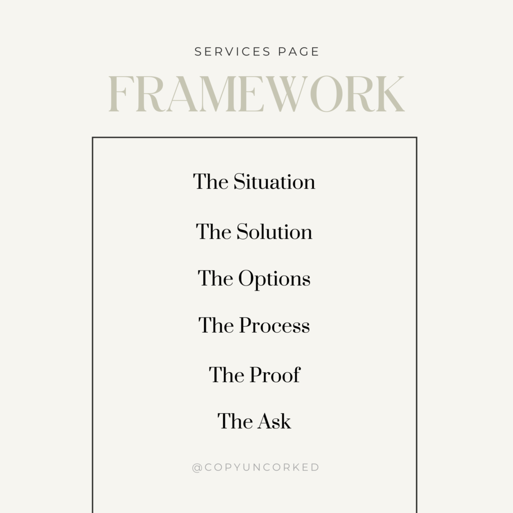
So below, we’re sharing a simple Services Page framework you can use to outline and get this ever-important page written, without wanting to pull your hair out. (A glass of wine always helps!)

No. 1 – The Situation
First things first, capture their attention by painting a picture or describing a situation that speaks to their current reality and the problem/need/or desire they’re experiencing. Do it with empathy, consideration, and specificity.
Although you do want to agitate the pain point a little just to help your reader see the impact/cost it’s truly having on them (in terms of their happiness, their health, their success, their sense of connection, etc.) but you can make it feel nurturing – like a best friend who just gets it. Your goal is not to make them feel bad about it, but realize they’re not alone, this isn’t their fault, and thankfully – there’s a path forward…
No. 2 – The Solution
Next, state exactly what you offer and a few unique features, benefits, or aspects of it.
How do you refer to your work/services? Are they done for you? Are they bespoke packages or standardized for a quick turnaround? What makes them unique or specialized? Are there certain tools or platforms you use that are relevant to them? What’s the why behind this solution?
Remember to address those key pain points/needs/desires you mentioned above and show what’s possible for them on the other side of it all.
No. 3 – The Options
Now, clearly lay out a few ways they can tangibly work with you to achieve their desired results/outcome. Three packages or options are a good benchmark to strive for (especially if they’re at low –> mid –> high price points).
You’ll want to share the key details and provide some indication of cost/investment. You don’t need to provide a complete menu or included every little detail at this point—your goal is to give them enough confidence that you have the solution to their problem/need/desire.
Don’t leave them guessing about how they can hire / buy from / work with you.
No. 4 – The Process
That being said, at this point, your reader likely has a few questions. So express ‘how’ it all goes down as succinctly and clearly as possible. Avoid getting too technical here – the idea is to assure them you’re a pro with a seamless and proven process to achieve results.
You can achieve that with a 3 to 6-step process, an FAQ question (ideally written as a response to objections), or some other way of illustrating the experience of working with you.
No. 5 – The Proof
Next, back up your offers with a compelling section that either shows:
- quantitative data
- qualitative results &/or examples of your work
- killer social proof or really kind words from peers / known industry experts
- hallmarks of your service that stand out compared to others
- or a compelling insight into your style/approach
It’s all about results here—you’re showing there’s proof in the pudding and you’re not just feeding them a bunch of wishful claims!
No. 6 – The Ask
Finally, don’t just end the page – ensure that you have a clear CTA that outlines the *exact* next step you want them to take (while reminding them of the dreamy result that’s in their near future!). So break out the buttons!
Pro Tip:
You can and should include call-to-actions throughout the page as well, ideally keeping them relatively consistent.
A Few Things to Note
Can you put these in a slightly different order? Of course.
Can you include more than one of a certain section (I.e. multiple testimonial / proof section)s. Yup!
That’s all part of how you can get creative with the design and really make this page your own. But if you have at least these 6 sections covered, you should be in great shape.
Give it a try and let us know how it goes!
P.S. You can also check out our tips + framework for writing your About page here, or head to this popular Home page formula we shared via Instagram.
Feeling stuck and looking for more support? Be sure to join the waitlist for our upcoming website copywriting group program, The Copy House. It’s a 6-week, guided course that takes you through the process of writing each page of your site with clarity + confidence.
Cheers,
Kaitlyn


Read the Comments +