Truthfully, I didn’t exactly set out to undergo a substantial brand refresh this fall. But sometimes when you pursue growth, evaluate new ideas, and learn as you go, new and unanticipated pathways start to form. And I tend to curiously follow them, wherever they may lead.
The Backstory
Chapter 1 of The Copy Uncorked brand began in May of 2019, so it’s still shy of the 3-year mark. (The business has been around for just over 5 years, but still – that’s not a very long time in the grand scheme of things.
Within those three years, we’ve had the honor of serving a number of creatives, small business owners, and brands across the globe. We’ve also predominantly been busy and booked out, which brings with it the challenge of keeping up with your own brand.
So despite the brand basically being in its toddler years, we’ve experienced and created a lot in a short period of time.
Including, the release of a number of digital products as well as free resources, multiple launches for 2 full-blown courses, the creation of 2 Facebook groups, a podcast, a variety of services and done-for-you offerings, and more.
We even had two entirely separate brand identities created for each of our courses, Vine to Voice and The Copy House.
The Evolution
With all of this in the works, I felt like I started to lose some consistency and cohesiveness – which also made it more difficult to outsource certain tasks – both within and outside of our internal team. The brand style was evolving and becoming even more elevated, which also left me with a craving to simplify and streamline.
So I reached out to one of my best friends in the industry and the original CU brand designer, Kadie Smith of Drop Cap Design with a mere request, “Let’s create one master color palette! I want it to feel neutral, editorial, earthy, sophisticated, and warm.”
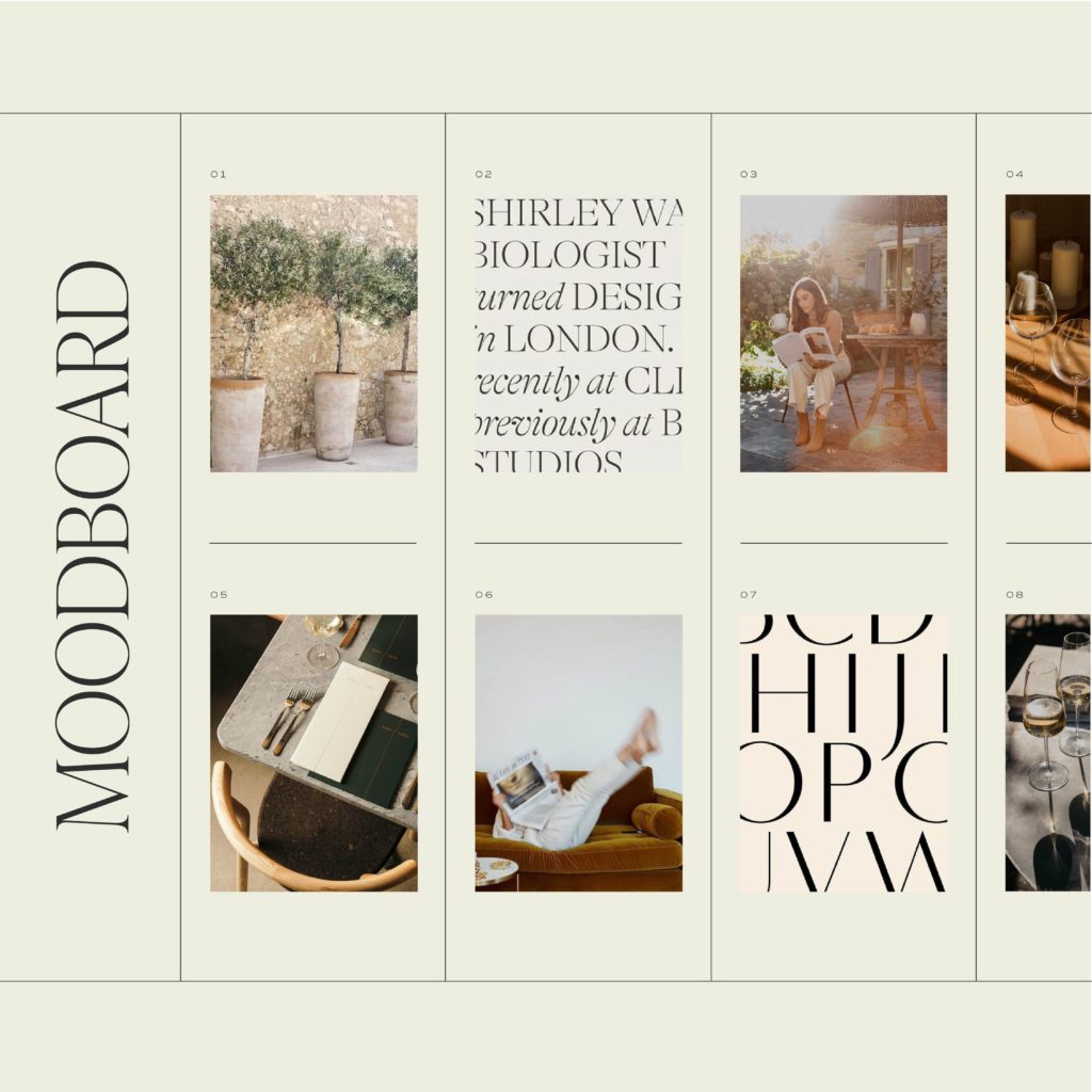
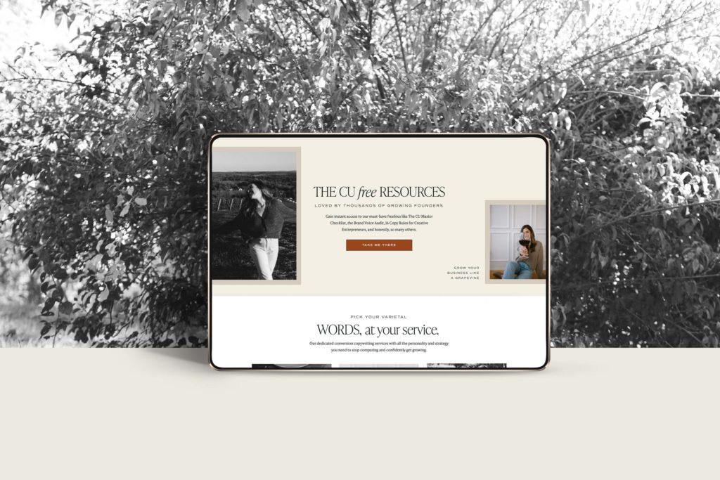
I should back up…this also came after a weekend where I allowed my mind to wander and play with restructuring and redesigning the website.
A few hours later, I was staring at the shell of a homepage design I loved and I felt ready to move forward with.
Psst!
Start with a template like we did! Meet Tonic Site Shop. Plus, you can save 15% on any design with the code COPYUNCORKED.
Flash forward to my design day with Kadie and she produced this stunning color palette which felt like the very best of Copy Uncorked, Vine to Voice, and The Copy House, all in one.
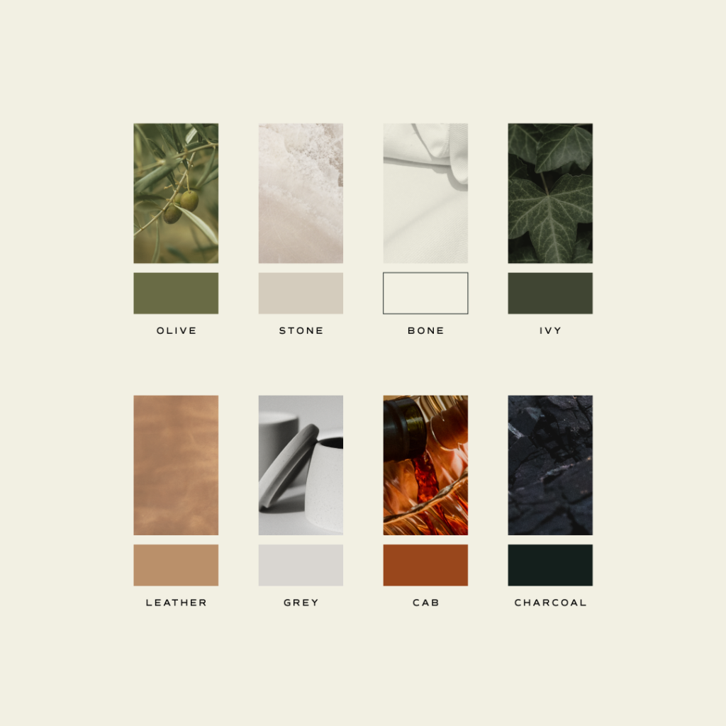
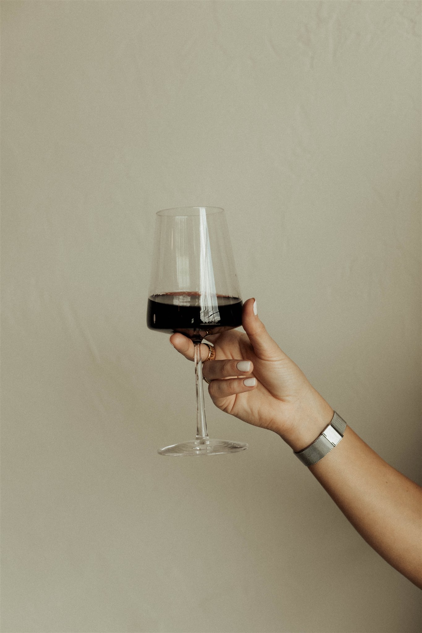
It’s obviously been inspired by wine – preferably a bold glass on the patio at dusk. With the depth of a Cab, the alluring calm of an olive tree, the comfort of a worn leather sofa, the contrast of light & dark neutrals, and the persistence of ivy – it’s both fresh and earthy, grounded and refined.
…just what we were after.
We then took things further, with fully refreshed typography, including this classic serif-style font for the body copy, which I’m loving.
Applying It All to the Website
With all of this in motion, a fall brand shoot was planned & booked (learn how to plan your own here!) and we progressed into fleshing out the rest of the website redesign.
Considering it’s – give or take – a 40+ page site (NBD!!), there was MUCH to be done and uhhh, wow, did it take a team effort and a few long hours (understatement of the year) of my own.
Thank you to the CU team and our development partners, Rebel + Rise, for your partnership on bringing this to life!
It was important to me that we took the same advice I’d give to any client, which is why I focused on a lot of restructuring (more so than just rewriting) to ensure the site was organized purposefully and strategically—versus continuing to just throw stuff on it haphazardly. Much of the original copy still rang true, which is why a lot of it stuck around, with some new lines sprinkled in here and there.
Some of the biggest changes and updates to note:
- Education vs. Agency – We intentionally chose to separate our educational offerings (affectionately referred to as “CU Edu”) from our agency offerings – aka anything that’s more of a done-for-you, project-based, or retainer-style service. Our goal has been to provide solutions for people at all stages of entrepreneurship and this allows us to demonstrate that with even more clarity.
- Updates to Services – The site launch also brought with it Editor-on-Deck, and opened Q1 2022 bookings for our Somm Day and signature done-for-you services like website and launch copy.
- New to the CU Shop – Freshly dropped in the CU Shop, you’ll also find A Guide to Launching & Marketing Your New Site & Business. It’s basically the exact same roadmap and templates we use for ourselves – and with our clients – to help them make a big splash. Now available to you at a killer price value.
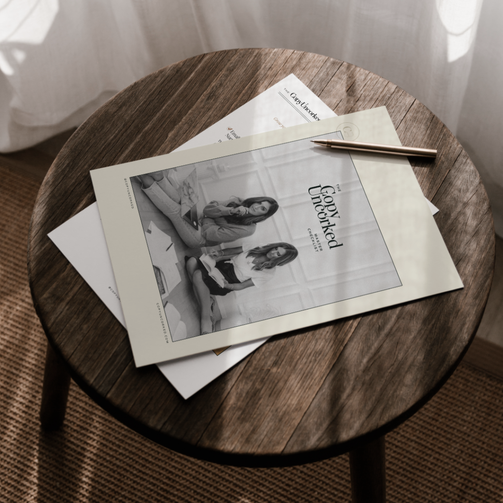
- Refreshed CU Master Checklist – With a cohesive new design, our go-to free resource has kickstarted a design refresh for alllll of our resources and digital products. Admittedly, some of those are still in the works and will continue to adopt the new styling over time.
- Unified Branding Across Edu Offerings – Apart from their distinct logos, you’ll start to see The Copy House and Vine to Voice adopting the same color palette and type hierarchy. As all good things do, that one will take a bit more time to complete.
- New Photography – No site is fully complete without professional imagery and we loved getting to head up to the rolling hills and wine country of Virginia to help capture the spirit of what we’re calling “Chapter Two” of the CU brand. (A major thank you to Danielle Blevins of Pieces of 8 Collaborative for being the gem of a human being and creative that she is!)
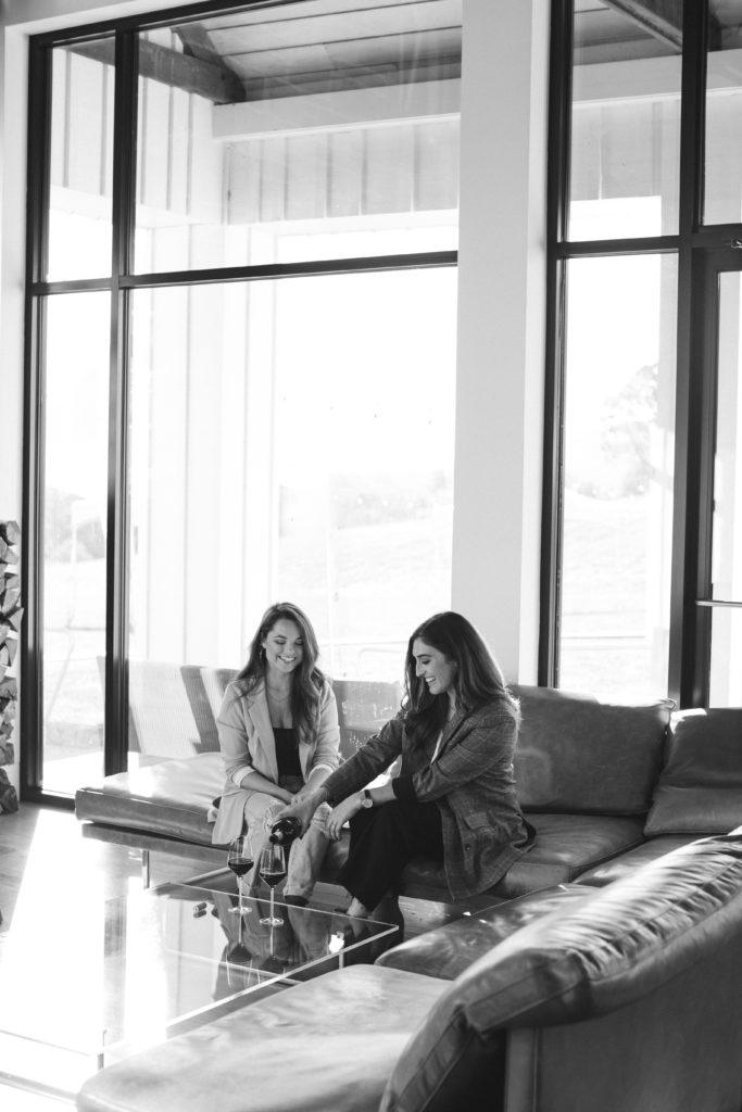
- New Team Members – We also recently onboarded CU’s local Director of Operations, Hannah Malone, as well as CU Team Writers, located across the U.S. I wish I could have literally everyone who’s played a role in this brand/business reflected in our brand photography, and will maintain that as a growth goal. Nothing beats quality time together IRL.
Phew – that’s a whole lot of ‘new’!
I sure hope it lasts us a long, long time. I certainly have a feeling that it will!
To an outside eye, it may have seemed like everything was perfectly fine and well, bringing with it the question, “Why go through all of this when you had a great site and brand?”
Ha. Hours and many investments later, it’s a great question. But it’s one of those things that I just knew in my gut I wanted to take on and see through to fruition. I also had the incredible support of Jac Relke, Hannah Nieves, Brooke Sager, and Jen Olmstead – who are truly some of the absolute best people I could ask to have in my corner.
Looking Ahead
Further, up to this point, I’ve invested in no paid advertising, no formal PR (other than a bit of guest speaking on podcasts and in masterminds).
I’ve only invested in branding and people – which is essentially what we ask others to do when they hire us.
That being said, I can definitely see exploring paid advertising and other revenue streams as we hope to impact even more people through our educational offerings in the not far off future.
What’s Unchanging
Before I close out this novel of a post (reflection makes me get sentimental and sappy), there are a few things that haven’t changed…
- Our timeless logo & mark
- Our mission
- Our laid-back yet refined approach
- Our methods/technique (fittingly now referred to as The CU Technique™)
- Our direction
- Our guiding principles
Integral values such as hospitality, innovation, open communication, collaboration, responsibility, and progress will continue to guide us as we reflect on what’s brought us to this point, and push our creativity as we step into the vision of being an industry-leading brand.
Here’s to a story that’s still being written…
Cheers, Kaitlyn
Read the Comments +
-
[…] The Refreshed CU brand & new website in November […]

[…] The Refreshed CU brand & new website in November […]